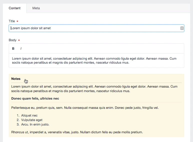
Notes Field
The Notes Field comes with five styles which you can use to style your field's Instructions field. You can update these styles in the Plugin Settings and select which style you wish to use in the Field Settings. Add the content you wish to be styled to your field's Instructions field (using HTML, Markdown, or plain text).
Notes fields can be expanded or collapsed on a user by user basis.
# Field Settings
To assign the Notes field type to your section, create a new Field and select the Type Notes. Once you have selected the Notes field type, you can select your preferred style from the style dropdown.
# Plugin Settings
By default, Notes have five styles:
- Primary Information
- Secondary Information
- Warning
- Danger
- Highlight
Understandably, these are extremely deterministic naming conventions. Ideally, in the future, we'd make it easy for you to update those names to whatever you prefer. Right now, that's what you get. If you need another style, such as "Disco", you are just going to have to appropriate one of the above names for your devious cause. If this is your dilemma, I'd recommend starting with Danger!
You can adjust your custom styles here. If you want to be able to style each block individually, you have to target the field's ID in the CSS. To do so, use the following naming convention in your CSS styles:
#fields-{{ name }}-field {} The {{ name }} value will get swapped out with your field's name to create the proper ID when the block is being rendered. Currently, spacing matters, so use the {{ name }} value exactly as you see it in the other examples.